There won't be weekly posts of
sketch-a-day any more, but no worries, I'm still drawing - and with color too.
As for the new year, trying new things like
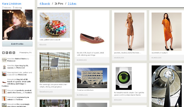
Pinterest - which was suggested by a good friend. Basically, as with other such services you come across something of interest and you can "pin it" to one of your self-created boards with a note, or contribute to others. Folks "like" things, and can "repin" as well. Simply put its your virtual inspiration board. I have boards for colors/patterns, for places, for well designed utility pieces, and for fashion - but you can make as many as you like and peruse those of others. I rather like the layout of the personal pins page (below) which is much like the main page on
Pinterest - for a visual person like me, who also has little real wallspace and is quite comfortable with digital spaces like this - it may just be the perfect place to keep track of those things that catch your eye/imagination.