Twitter Updates

    follow me on Twitter

    11.30.2009

    Libraries w/o Books

    The book will always be around, the book is dying.
    The library is dead, long live the library.
    The culture of information has eclipsed the traditional notion of library doors as the gateway to knowledge. Perhaps now it would be better to think of the library as the repository of learning space - a place to do your knowledge acquisition, not necessarily the home of that knowledge.
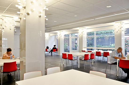
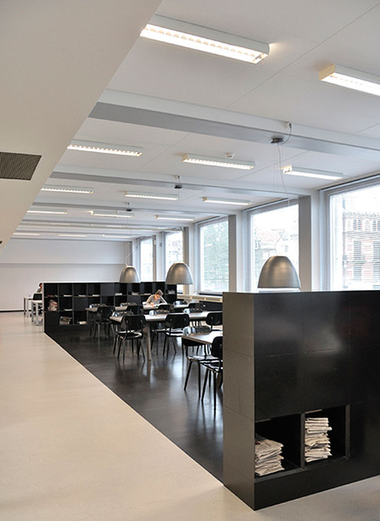
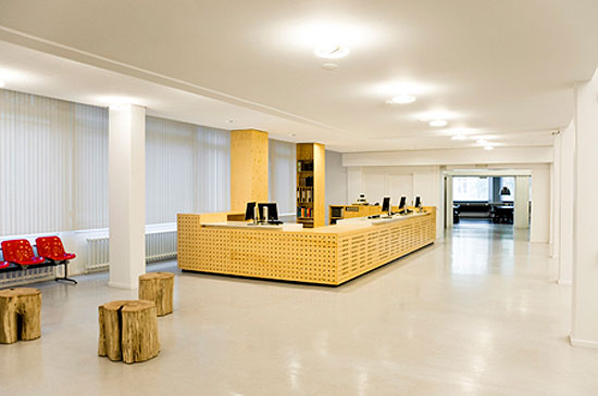
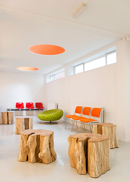
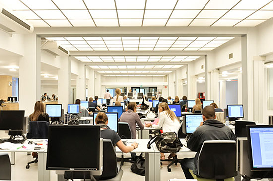
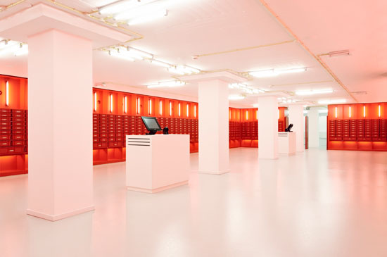
    The recent redesign of the interior of the library of the university of amsterdam - by studio roelof mulder and bureay ira koers - removes the books from their erstwhile position and creates spaces for all types of studying. There are computer terminals, quiet rooms, group areas plenty of light and spaces to take a break in as well - but the books? The RFID tagged books have been centralized to a beautiful warehouse-style space that allows students to find and check books out themselves - simplifying locating and re-shelving as well as reducing the burden on staff and increasing the hours during which books are accessible.

    The excerpted images below show a sampling of the space including the striking book depository. This renovation is thought of currently as a tide-over project until a new library can be designed and built - but one has to wonder if the books would return to their traditional shelves after this?
    Also consider as e-reader devices take greater prominence - more universities will hand out the devices loaded with textbooks and other material - all aiming at paperlessness - and further cementing the new role of the library - perhaps one day we'll refer to it as a gnariary or sciarca - but latin isn't my strong suit - had studied in a better space in 6th grade, perhaps it would be.


    via DesignBoom
    all images courtesy studio roelof mulder and bureay ira koers


    "

    11.24.2009

    Bare Shelves or at least the products on them

    Imagine shelves stocked with bare minimal facades...attracted to the product itself, not its flashy colored sheath. It reminds me of the aesthetic of a Muji store - simple products, simple packaging, a place where the items aren't shouting at you


    Paint-Free Coke Can Saves Energy, Reduces Pollution: Via Inhabitat

    sustainable design, green design, coke can, harc lee, unibody coke can, monochromatic coke can, product packaging, recycling

    Designer Harc Lee has created a “naked” Coca Cola can that forfeits Coke’s typical bold red and white stripes in favor of au naturale silver. The aluminum can is created without using any paints or dyes, and stands to greatly reduce pollution and energy use associated with producing and recycling soda cans.


    LA - The Urban Oilfield

    It's interesting if you weren't aware of the oil fields in LA to see the extent to which they are still a large part of the city - though some are much more hidden than others.
    The ViceTV video is interesting for some of the oil drilling locations it shows (Beverly Center) - though the narration isn't all that genius "except now no one sees what's happening underground"
    Via Fast Company


    Gushing About L.A.'s Cleverly-Disguised Urban Oil Fields: "

    Anyone who arrives at Los Angeles International Airport is immediately introduced to our oil wells, a series of slow-moving creatures nodding throughout the hills heading down into the basin. But those highly-visible pumpjacks are only the tip of the Texas tea, as it were. L.A. has 41 lesser-known active oil fields in the city--and one famous one, the La Brea Tar Pits--pumping more than 20 million barrels out of our palm-fringed streets annually.

    oil

    VBS.tv, the video channel for Vice, visits several of L.A.'s best in-plain-view sites (most, in an interesting coincidence, are located beneath what are now shopping malls), as well as a smaller, privately-owned well. For perspective, however, check out an overlay map of the 100+ Los Angeles wells 103 years ago.

    [VBS.tv and Design Observer]

    "

    11.18.2009

    Light and Shadow Re-viewed

    We see light and shadow everyday, but we do not always appreciate their power. Below are two groups of images that re-view this common occurrence and provide a different perspective - playful and challenging - which reminds me of the times when i've seen something that wasn't actually there but could have been - and clearly was suggestive enough for me to perceive it.
    The first pair of images are of a table that creates its own "sunlit" shadow, the second set is a series of images that turn look as light/shadow as physical objects.


    ‘the subconscious effects of daylight’ by daniel rybakken, 2008Via DesignBoom


    le creative sweatshop with khuong nguyen:
    Via DesignBoom


    11.16.2009

    L.A.'s Gold Line

    Infrastructure is a wonderful thing. Los Angeles once had a variety of street cars - they are, in large part, the source of the original sprawling nature of the city. Many of the tracks were ripped up or simply paved over as the automobile took priority in development plans. That has begun to reverse, as city planners realized, finally, they cannot out-build the demand for roadways. Hence, this past Sunday, the latest light rail line opened - some of which travels over existing rails and bridges from the erstwhile era of transit. Perhaps my favorite part of this line is that it truly aims to integrate into the fabric of the city, being a foodies caravan as The LA Times already published a comprehensive dining guide to the line. Enjoy the excerpt from the Fast Company article below and the next time you're in LA - get out of your car and cruise the Gold Line.


    Riding L.A.'s Newest Rail Line: "

    L.A. gold line

    Thousands of transit-curious Angelenos will be angling for a free ride on Los Angeles's newest light rail line when it opens this Sunday. The Gold Line Eastside Extension is a $898 million, eight-station line more than 10 years in the making that will service a corridor from downtown's Union Station, through Little Tokyo and Boyle Heights and into East L.A., and connect with the existing Gold Line that heads northeast into Pasadena. Fast Company got a preview ride this week (so keep in mind these photos were taken in motion).

    breda

    The line is electric, powered with overhead catenary wires, and will be operated with Breda trains, which are manufactured in Italy. Trains will run every 7 to 8 minutes at peak times, up to ever 20 minutes at night. Projected ridership is 13,000 people per day, but keep this in mind: The last major line of service that L.A.'s Metro opened in 2005, the Orange Line through the San Fernando Valley, reached 23,000 daily boardings in 2007, a goal it was not expected to reach until 2020.

    bridge

    An s-bridge constructed over the 101 freeway, heading south out of Union Station (that's Metro's headquarters in the tall building to the left) was built without ever stopping traffic on the major artery. The Gold Line extension is also the only rail line with continuing service out of Union Station; all other rail lines terminate there.

    marichi

    Although the train runs primarily above ground, traveling along existing right-of-ways left behind from old street car routes, it goes underground to service two stations in Boyle Heights. One of them, Mariachi Plaza, is a historic square named for the many mariachi musicians who work in Los Angeles and live in the nearby 'Mariachi Hotel.' The patterns in the canopies here are inspired by the colorful accents on their costumes.

    station

    Each station design is unique, but most of the above ground stations follow this canopy formula using tensile teflon fabric and steel frames. Under the lead architects at Barrio Planners, a team of one architect and one artist were chosen for each station and created pieces to reflect the character of the different neighborhoods. Metro offers free art tours of the stations.

    [Mariachi Station photo by waltarrrrr]

    [Metro LA]

    "

    11.12.2009

    CompuJewelry

    All the data that we can so easily collect and manipulate these days - infographics galore....and now its wearable. FastCompany has shown two designers of such data-jewelry recently - today was my favorite, if only because its more varied and better priced: Nervous System


    Geekiest Chic: Computer-Generated Jewelry: "

    Nervous System designs custom, high-tech jewelry on the cheap using rapid prototyping.

    visualization jewelry

    What do you get when you combine the brains of one Harvard-educated architect and one MIT Media Lab vet? Nervous System, a company that makes bespoke jewelry using generative algorithms.

    These pieces are cheap, compared to the custom data-visualization jewelry and furniture we've covered before--just $25 to $50 for a ring or necklace. And that points to a seachange in custom design. While rapid prototyping and computer modeling usually produces expensive one-offs, Nervous System is actually showing how those technologies aid in very small-scale production. As they tell Design Glut in a new interview:

    visualization jewelry


    visualization jewelry


    visualization jewelry

    Read the full interview at DesignGlut.

    "

    Watch Redesign - Clocks

    I'm not sure of the $2400 pricetag, but furthering the Watch-Redesign topic with this more steampunk inspired piece and it is really a beautiful timepiece. Additional examples of novel timepieces are below (I'm partial to the word based: QlockTwo)


    Clock on a bicycle chain: "
    A reader writes, 'The Catena wall clock harkens back to traditional mechanical clocks. Copper digits mounted onto a bicycle chain place emphasis on the cyclical nature of time. This clock is a striking clock, literally and figuratively.'Well, not literally. But figuratively. And man, was this thing ever designed to fire up the desiderata center of my brain.

    Catena Wall Clock


    via BoingBoing


    via DesignBoom


    via Gawker

    11.11.2009

    Rendering

    There are some standard approaches to design rendering and of late the photorealistic render is all the rage. An example from the upcoming Hard Rock Hotel - Vegas is shown below. It is certainly impressive - designed to allow the laymen client to understand the design - it asks them to do nothing but look. I'm not a big fan of the photorealism, I think the client should be asked to imagine the space and have faith in the designer(s) and the rendering should show them the potential of the space - but you cannot possibly fully represent how a space will actually appear - until it is there in front of you. The rendering of the space should suggest the potential and once the space is built - the rendering becomes a work of art - documenting the process of design. To that end I offer the work of Chloe Early - who appears to be quite a talented artist overall - but her approach to the architecture in her works is particularly striking and seems to me a beautiful way to show both form and function of a built environment. There are a multitude of non-photorealistic rendering styles and I hope you explore some of the beautiful work.


    p

    Chloe Early via Sweet-Station

    11.09.2009

    Compact and Versatile

    Generally compact and versatile refers to swiss army knives and perhaps cars
    like this Renault concept vehicle:


    Zoe ZE Concept

    Then there is the compact and versatile "Stand Up" furniture by korean designer phillip don. This type of flexible use is key for the vast majority of folks, but far too many people have adopted the "specificity" approach to such things. Either they get a piece of furniture because a space is specified by convention and not because of how the individual intends to use the space - or they find a piece that meets one of their needs and don't wait or invest the time/money to maximize the usage. Although an ideal to have such flexibility and dedication to crafting ones space - i think when you can you should at least try. Enjoy "Stand Up" and similar pieces below.


    stand up collection


    via DesignBoom.

    These pieces are reminiscent of work of former classmates of mine from last Winter


    11.06.2009

    Visualization of Our Relationship with Media

    beautiful and disturbing and portend to the potential of our relationship with media via SweetStation

    The artist is Diamante Murru:

    p

    p

    p

    p

    Diamante Murru from Cagliari, Italy. Check her out on Myspace as well.

    p

    "

    11.05.2009

    Watch Redesign

    The surge of wristwatch (and time pieces in general) redesign in recent years seems to me to be due to the general frustration with the insistent status quo of the "normal" aspects of our lives whilst there has been some major transformations courtesy of the internet and mobile devices. Whether or not these new approaches to a mundane task will help us look at other things with fresh eyes only [sorry for the pun] time will tell.
    Below is the latest example, see also TokyoFusion


    0Hundred Watch by Knot Design: "


    11.02.2009

    keiji ashizawa - 'drawer shelf'

    This is a fun storage piece from Tokyo Design Week. I'm not sure the usefulness of the side-to-side, but i like it. Perhaps some hiding of important documents or minimal flat filing, or making your space more pet friendly, those kitties like to explore. Clearly if you didn't intend to keep them stacked they could make for interesting display as well.


    keiji ashizawa - 'drawer shelf': "

    tokyo design week 09 as seen in the exhibition superprototype is 'drawer shelf'
    by japanese designer keiji ashizawa. the drawer consists of 3 levels that can be
    arranged in various positions. it has been produced in collaboration with
    company tanseisha.


    'drawer shelf' by keiji ashizawa


    "