Twitter Updates

    follow me on Twitter

    2.22.2010

    Is this love: herzog and de meuron: vitrahaus exterior

    I think I just fell in love. I don't normally do this, but this caught me off guard. Its simple - in the basic form (2D house), its dynamic in its use of the form (stacked & cantilevered) and it is utterly inviting (large views of what's inside, benches integrated into courtyard facade). Also, detailing - i mentioned the integrated bench in the larchwood facade of the courtyard, but wait till you see the drain pipes - wait what?!? - Yes, actually, you don't see them - they are enclosed in the plaster, but drip their delivered goods into framed drainage...perhaps a detail only the odd will enjoy. In short, I am due in Weil am Rhein, and though I am dissappointed that interior images of the museum are yet available, I'd rather explore the movement through the space with my own two feet and with my sneaky camera in hidden hand. There are more images (really - even more!) on Design Boom's site (including models of the building), along with a clip of Herzog himself discussing the concept. View and drool, and share your gushings - or if possible - criticisms (i dare you!). UPDATE: There are interior images - view and wipe your face!

    herzog and de meuron: vitrahaus in Weil am Rhein

    'vitrahaus' by herzog & de meuron
    image © designboom


    vitrahaus
    architecture by herzog & de meuron
    photographer iwan baan
    image © vitra


    image © designboom

    image © designboom

    image © designboom

    by day
    image © designboom


    in some places the houses are cantilevered by up to 15 m

    image © designboom


    image © designboom


    image © designboom


    image © designboom

    the vitra design museum shop

    image © designboom

    image © designboom

    part of the design was that water pipes run out of the plaster rather than along the building
    image © designboom

    a worm's eye view of the stacked volumes intersecting one another
    image © designboom


    2.17.2010

    Changing Perception

    There is considerable amounts of our life that are based on assumptions. Without basic assumptions (the sun sets and will rise again) our daily life would be much more challenging (we assume folks around us understand the language we share, and that clothing is appropriate and certain currency is valid...). These assumptions also apply to how we experience space: how doors open, how walls are solid, floors are flat. Poor design, however, can turn our assumptions against us and cause us to think ourselves inept, when in fact it is a failure of the design to match assumptions - or to apply to a different culture's assumptions. This phenomena is well explained in the wonderful book by D.A. Norman Design of Everyday Things.

    Not all design that challenges our assumptions is bad, it can be advancing new assumptions, or challenging stale cultural ideals. One such notion is that of the treatment of mental health. Whereas once all those with any mental issues were hidden away in institutions, today there is a blend of talk and pharmacological therapies for those struggling with such issues. One approach on the talking side of therapy is that, in many cases, the mental health of an individual only becomes problematic when there develops a significant discrepancy between internalized assumptions and the outside world. Based on this approach, one can best help mental health concerns by breaking down assumptions as to help re-align them [clearly not all mental health issues can be addressed in this manner, but this is only one approach]. The mental health clinic designed by Nendo in Tokyo has built this philosophy, physically. This clinic provides "standard consultations with a psychiatrist, corporate consulting and support for patients returning to the workplace."

    Enjoy the photos below and share your thoughts on this unique space (given its function).

    nendo: mental health clinic, tokyo: via DesignBoom
    all images © jimmy cohrssen


    2.05.2010

    Parking Structure Hotel

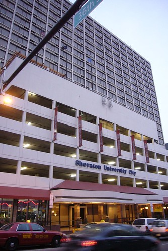
    This is one of two hotels in the University City section of Philadelphia. It is adjacent to the two major universities, one of which is Ivy League. Does this look like what you would imagine would match the above description? No? Does it look like a parking structure? Yes! That's because it is - in part, the part that 'welcomes' their guests.
    I get it - parking structures are a necessary evil in the culture of the auto in which we've resided for the last 60 years or so. Parking structures are holding cells, dead-space, they are not active - you place your vehicle and you leave, you find your vehicle and you leave. So who thought this should be so prominent and bald. Utilitarian, certainly, but I cannot imagine that Sheraton conceives of its brand as such.

    Let us explore some approaches to parking structures.


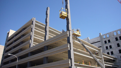
    There are parking structure kits, it seems, as illustrated below. These are dino-sized tinker toy, assembly requires a massive crane. However, these are quick to build, and seem to have custom color options - though, I would assume all options are in the "neutral" range.


    There are disguises for parking structures. Pictured below is the woven facade of a structure. Adds considerably more visual interest than the default solid/void alternation of standard models. It isn't as colorful as some, but it is a simple and more graceful approach.

    As for the Sheraton in University City... It has some potential. To start lets break down its core form - intersecting boxes

    The entrance to the building is relatively unemphasized, it could be enhanced by reinforcing the existing intersecting boxes all while denying the parking structure-ness of the front facade. This would be the most simplistic update. The new facade could be a solid continuous surface or a perforated screen and could protrude from the current facade. Removal of the burgundy awnings and refacing of the existing concrete 'awning' with a similar material to the upper facade, as well as more linear lighting could better serve the entrance by making it more noticeable and inviting.

    There are many possibilities for this building, one could imagine aluminum ribbons (sketched below) or something as bold (garish, even) as an Escher inspired screen wrapping the entire parking structure that showed the mascots of the adjacent universities transitioning into one another.

    One of the largest parking structures in the city of Philadelphia is scheduled for a massive mural project based on the photography by J.J. Tiziou of dancers in the city. How Philly Moves will eventually grace the 50,000 sqft facade of the airport parking structures looking a bit like this:


    Both images courtesy J.J. Tiziou

    1.23.2010

    Marvel

    Wandering about the city, en route or just cause, there is so much to see, we may miss it, we may tune it out as to prevent being overwhelmed, but it seems to me we, on average, do not appreciate the many wonders we are surrounded by daily. if you woke tomorrow and the world had been reset, how much could you rebuild? lean-tos and fire pits or skyscrapers and transcontinental railways? I did not make these, you may have had little or much to do with the creation of these items - the closest thing to permanent we have is the collected knowledge to build. Why do we not marvel at our own creations?

    A collection of images from recent wanderings, as the winter light generally is the most beautiful. Sometimes we feel like we just found our eyes.


    1.05.2010

    Modern Organic - Minimal Plops


    The modern organic wave is quite a significant one, and seems rather popular of late, hence a second post on the same topic. This go'round, however, I'm illustrating the design mathematics of what I call Minimal Plops. I understand that "plops" is not the most graceful word, at first, but I think you'll come to see it as a playful onomatopoetic signifier of a growing field in design.

    Lots to make sense of, lets start with the basic variables that come into the design equation that begets minimal plops.

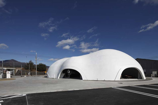
    First up is the external form of a plop. As it sounds it is curvaceous and in relative proximity to the ground. I present "hot fudo" by takeshi hosaka architects. The shape is clearly what one might label as "organic" which for many folks just means not rectilinear. This form has its own history as ancient as bark-covered sweat lodges, mud huts, and igloos. It is architecture which is a bubble formed in its surroundings, though the stark white clearly separates it from that surrounding as well.
    hoto fudo
    photo by koji fujii / nacasa & partners inc.
    image courtesy of takeshi hosaka architects via
    Designboom

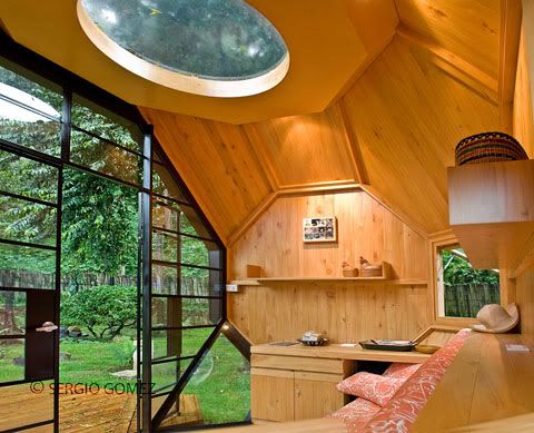
    Next is the function of the plop. Plop is a small thing, it could be called a dollop. What use can such a small space serve the modern person? A residence, yes, but many folks in they overly developed world might consider this more a getaway space, perhaps a guest quarters or artists studio/office. I give you Polyhedron Habitable:

    Polyhedron Habitable via SweetStation


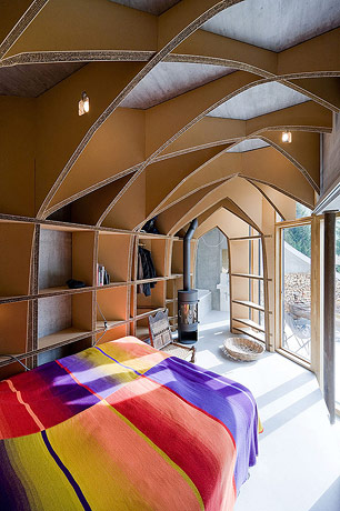
    Onwards to the interior form of the plop. This structure is practically a dream home for me, but it also takes "of the earth" vernacular architecture cues from the likes of the Anasazi cliff dwellings while incorporating modern steel & glass (and satellite dish). It responds to the almighty grid while being asymmetric and irregular - form following function from the looks of things. Yes I'm using an external shot as my evidence for interior form, but what begins on the outside is continued on the inside, shown in the second image of Villa Vals by SeARCH.
    Vila Vals by SeARCH via arch daily

    Finally we have the structure of the plop. There have been inovations in materiality of late, this also coinciding with many massive natural disasters which have brought considerable attention to the need for rapid shelter units. One of the most striking both in terms of material and rapid construction are the Concrete Canvas shelters. Delivered as a relatively small bundle, to which you add water, inflate, and allow to set, one person can set it up in 40 minutes and the concrete is set in 12 hours.

    Now the external form, function, internal form, and structure come together and we have the ultimate Minimal Plop: Blob (VB3) by dmvA. All of the above variables come together to create this little form and though not all literally represented - i.e. its a polyester over wood construction, not concrete embedded fabric - the allusions are there. This Blob is a coalescence of many of the architectural/material/structural ideas floating about these days which all speak to the Modern Organic aesthetic of our technological age. After you meet Blob, you will have a glimpse at the potential future of Miminal Plops.

    I will note, that Blob may make you think Airstream, or other such units - and that is a valid reference point, and I adore Airstream. However, I think those units aim to recreate the same "home" environment, just on wheels, where as the Minimal Plop re-imagines how people want to/could use space and removes the automotive necessity. We'll be carless in the future, remember?

    Via Designboom - meet Blob (VB3)

    'blob VB3' by dmvA
    photo by mick couwenbergh/rini van beek


    photo by vercruysse frederik

    photo by vercruysse frederik

    photo by vercruysse frederik

    image courtesy dmvA
    photo by mick couwenbergh/rini van beek

    photo by mick couwenbergh/rini van beek
    image courtesy dmvA


    plan of blob VB3
    image courtesy dmvA


    The future of the Minimal Plop - the plop skyscraper via
    Inhabitat This seems rather futuristic - in a Jetsons (optimistic) or Matrix (pessimistic) kind of way - depending on your preferred outlook.