Twitter Updates

    follow me on Twitter

    12.23.2009

    Modern Organic Architecture

    There have been a couple of tree/nature inspired architectural works completed recently. This striking form of modern organic aesthetic is a product of technology, and is certainly beautiful, but has been around for a while - if not in the same white form. Below are images from the historic preservation efforts at Koldinghus in Denmark followed by two of the most recent projects of this particular style. The Koldinghus project, which entails a system of structural columns which float a ceiling and curtain wall over the historic structure, was a much discussed "restoration" which started in the 1980s and was completed in 1991.

    I am a fan of this style for its navigation of the balance between man(-made) and nature(-inspired) though of course sometimes a building should reflect what it truly is, unnatural, allowing for the seeking our own balance between the world we create and the one we derive from.


    photos by KaraML Additional images


    Via DesignBoom
    serie architects / chris lee and kapil gupta: the tote, mumbai


    image courtesy serie architects
    photos by fram petit


    Via ArchDaily
    Leaf House / Undercurrent Architects: "
    © Hugh Rutherford

    © Hugh Rutherford

    © Hugh Rutherford

    © Hugh Rutherford

    12.22.2009

    Future Commute

    As the world moves towards a less wasteful approach to day to day life there is an attempt at making mobility friendlier as well. Not everyone can telecommute nor is everyone convenient to mass transit in terms of trains and trolleys, but buses may be the future of transit and not at all as you picture them now. Talk to the regular train commuter and one of their favorite reasons for the train is their ability to do work or catch up on personal reading while traveling. The bus of the future will do just that - it will provide work surface and cupholders for the office on-the-go vibe and with such city-wide wireless networks popping up like Clear and those provided by cell phone providers folks can get things done while getting to work. All this while using the existing infrastructure (roads) while reducing congestion (number of vehicles). Though the renderings below are suggestive of the future of the bus, I do think such a vehicle would have to be quite nuanced in its design to make for a comfortable workspace as well as aid in the destruction of the preconceived negative notions folks tend to have towards the mode. Bus is not a dirty word, and it may be the key to the future.

    From FastCompany:
    Commuter-Friendly Office on Wheels Puts Bus in Business:

    office Bus

    [Via Core 77]

    office Bus


    See also New York City Unveils New Silent Electric Bus

    12.21.2009

    Urban Abstraction

    Designboom recently featured the temporary wood structures of ryuichi ashizawa architects. One of the structures in particular was striking. The simplistic plywood in a short jagged accordion form creates a really unique sense of space (pictured below). The dynamism of the form coupled with the strictly controlled view framed by the opening really feels like an urban abstraction - to the extent that urban environments are full of movement and yet impossible to view more than small excerpts at a time. As you stroll down the streets as familiar or foreign as they may be - you cannot help but see a mixture of structures, skyscraper to rowhouse - commercial to residential, and your movement changes the ratio of types and the types of folks, therefore, that you would encounter. The location of this structure on an island surrounded by city furthers this removed abstraction of the urban environment.

    enjoy!


    image courtesy ryuichi ashizawa architects

    image courtesy ryuichi ashizawa architects

    image courtesy ryuichi ashizawa architects

    image courtesy ryuichi ashizawa architects

    12.14.2009

    Technacular Architecture

    Building to your local resources [vernacular architecture]...we used to do that exclusively. This is how "salt box" houses came about in New England and adobe homes in the southwest. Over time we could venture away from location-specific design because technology allowed for ease of building and artificial temperature control. Technology allowed us to ignore what previously dictated how it was to live in a certain area. However, our growing concern for waste has us reconsidering our local requirements and resources and now we're seeing that the future is blending the two - technology and vernacular.

    A recent excellent example of this hybrid model was recently covered on Inhabitat as welll as a write up on Malcom Wells from DesignBoom - which illustrates his approach to vernacular architecture and technology as expressed via his beautiful drawings (below):

    Deep-Seawater Air Conditioning System to Cool Honolulu: "

    sustainable design, green design, Honolulu Seawater Air Conditioning, Honolulu, deep-sea system, air conditioning, green energy, Waikiki, underwater technology

    Frigid seawater pumped in from the ocean’s depths will soon help cool more than half of the buildings in Honolulu’s downtown. Honolulu Seawater Air Conditioning LLC, which is undertaking the $240 million project, expects its technology to cut the Hawaiian city’s air conditioning electricity usage by up to 75 percent while slashing carbon emissions and the use of ozone-depleting refrigerants.

    Read the rest of Deep-Seawater Air Conditioning System to Cool Honolulu


    Malcolm Wells: passively heated underground buildings: "
    tree bridges


    explanation of underground architecture
    image courtesy of malcolm wells

    "

    12.04.2009

    Void as Connection

    Henderson Waves bridge is a beautiful example of a pedestrian bridge. This space is like a park in the sky of Singapore. If we stopped to think of a bridge as a place to stop and think - then perhaps we'd have more poetic bridges like these and fewer baldly utilitarian structures that ironically become voids between two places. Enjoy the beautiful images of this bridge by RSP Architects and below that images from other great "green" bridges from around the world.


    via DesignBoom


    Top 5 Most Innovative Green Bridges on the Planet via Inhabitat


    8th Street - Urban Seating

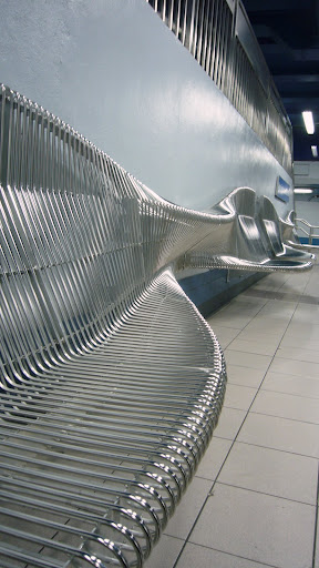
    There are some things that you pass in your day-to-day that you fail to notice. Much of the urban landscape becomes backdrop - with bits and pieces that stick out and make you say "wow." Philadelphia has such a piece in its 8th Street subway station. These wall-mounted structures offer seating, leaning/shelf for tending to one's bag, all while being a striking visual dance of bent metal. They serve several purposes all while keeping the station easy to clean (wall-mounted = ease of floor cleaning) and I would imagine the pieces themselves are quite easy to maintain themselves with their shiny metal and all. These benches address security concerns as well by being open (for visibility for items underneath) and providing decent seating surface area while deterring unnecessary loitering without resorting to the "armrest" insert - a common and unsightly tactic.
    In short, these benches address all of these concerns when designing for public spaces [security, maintenance, and user experience] and do so gracefully. Important to note, there are several designers who address this concern of urban seating - a particular designer was recently featured on DesignBoom and 3 of his pieces are shown below - compare them to the 8th Street benches and let me know what you think.


    alexandre moronnoz: urban seating: Via DesignBoom
    'muscle', 2009 by alexandre moronnoz
    steel, zinc coat & heat-lacquered paint finish


    'Y', 2006
    retified timber with no surface treatment, external resistance. digitally milled.

    interferences, 2007

    interferences, 2007
    steel, laser-cut, folded & welded. zinc electroplate & epoxy paint finish

    "

    12.01.2009

    Lovely Underground

    There is something particularly striking, to me, about underground environments. DesignBoom recently posted a collection of images and descriptions of some of the most amazing subway architecture around the world. I am personally biased towards the Munich system and had gone so far as to develop a music mix to compliment the slideshow of the Flickr photo-pool dedicated to the system, which you can listen to and view here. I've included a handful of the images from the article, but suggest you view the full article at DesignBoom to read up a little on these various systems, none of which are in the US (shock & awe, i know). Clearly, other parts of the world have higher ridership than here and thus have the resources and the requirement of their patrons to make their stations as interesting/appealing as possible. Of course, this type of unique beauty also brings non-traditional riders to the systems as well - I myself am a total public transit tourist. Can such striking elements bring more riders onto US systems? I believe so and think that we will see more of this type of work in this country in the future.


    stockholm tunnelbana

    t-centralen station (photo via flickr)


    solna centrum station (photo via flickr)


    munich u-bahn

    westfriedhof station light installation by ingo mauer (photo via flickr)

    candidplatz station (photo via flickr


    bilbao metro

    bilbao metro station by foster+partners


    bilbao metro station by foster+partners


    shanghai – bund sightseeing tunnel

    trains in the bund sightseeing tunnel (photo via flickr)


    bund sightseeing tunnel (photo via flickr)


    tokyo - iidabashi station

    iidabashi station by makoto sei watanabe architects


    iidabashi station by makoto sei watanabe architects


    moscow – komsomolskaya station

    komsomolskaya station (photo via flickr)


    komsomolskaya station (photo via flickr)


    barcelona – drassanes station

    drassanes station by on-a arquitectura


    drassanes station by on-a arquitectura
    "